
PROJECT OVERVIEW
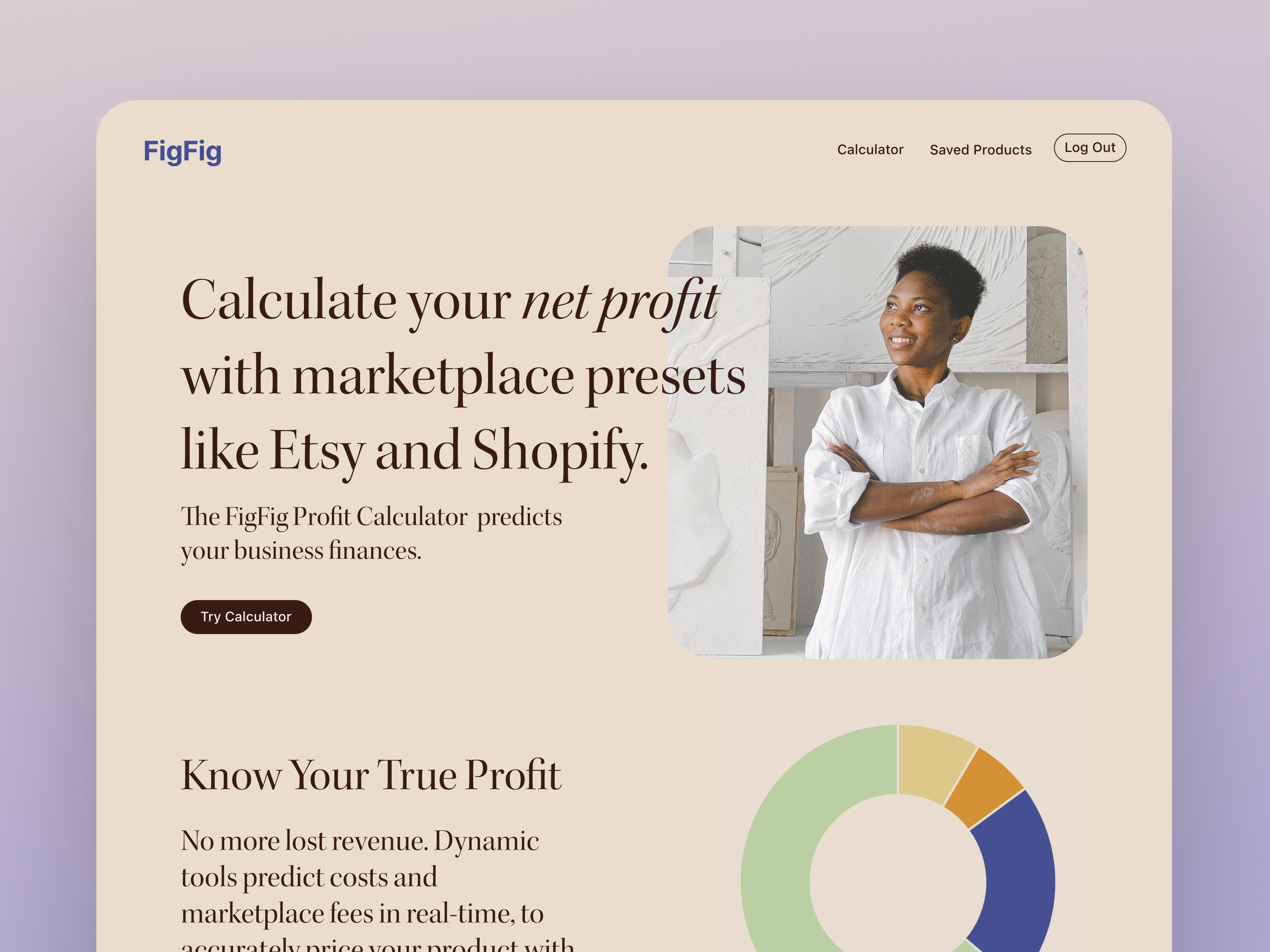
FigFig is a financial dashboard I conceived and built for independent creators and small business owners — designed to simplify profit tracking, margin forecasting, and inventory insights in a single interface. The project came from a real gap I observed: creators managing multiple revenue streams across multiple platforms with no tool built for how they actually work.
ROLE
Founder, Product Designer & Builder
SCOPE
End-to-end: Concept, UX, UI, full-stack build (Bubble.io)
THE PROBLEM
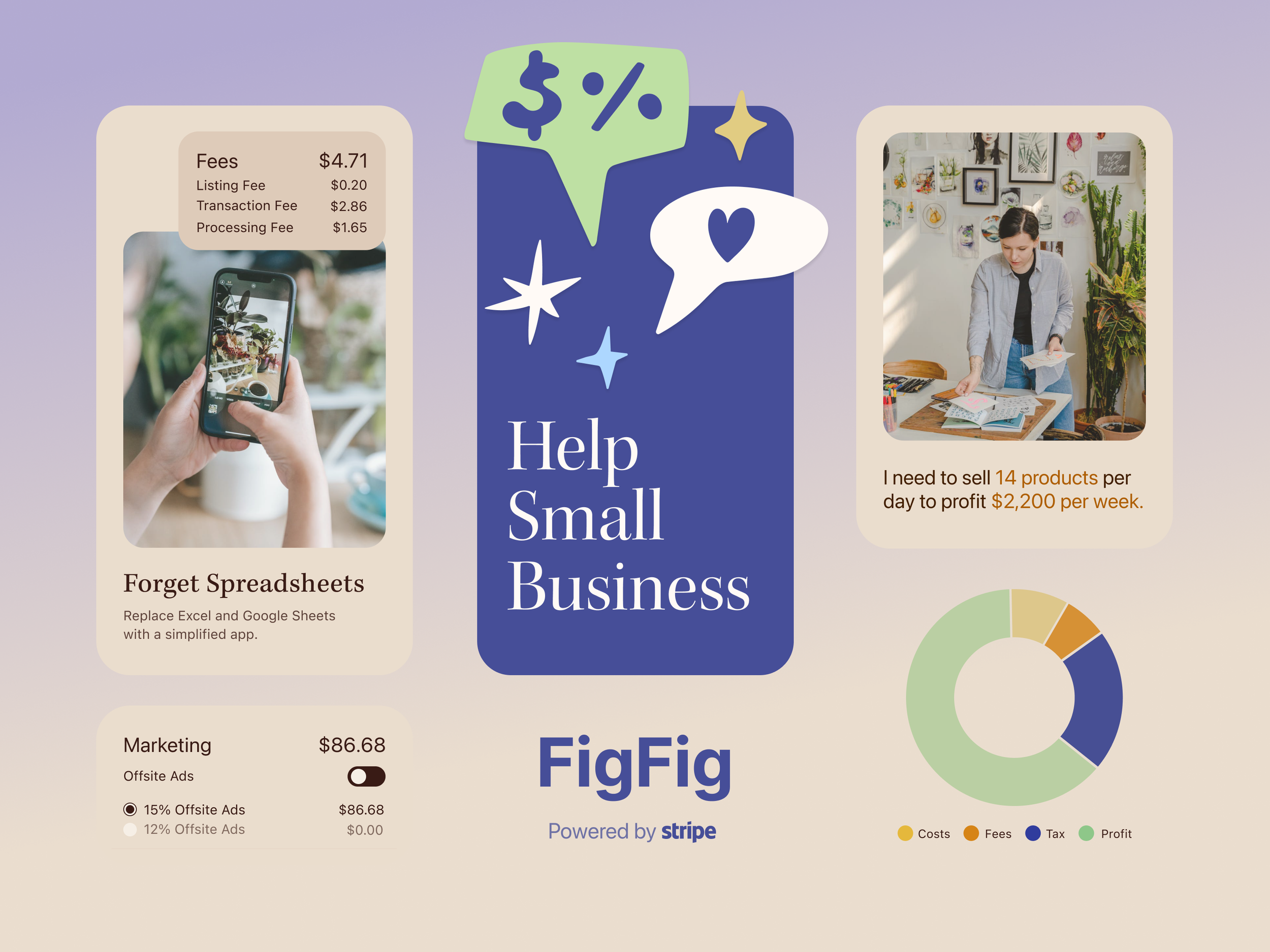
Existing finance tools fall into one of two failure modes for creators: they're either built for accountants (overly complex, wrong mental model) or built for consumers (too simple to surface business insights). The result is creators doing manual tracking across spreadsheets, losing time and often misreading their own financial health.
The core need wasn't more data, it was clarity. Creators needed to understand margins, forecast outcomes, and track inventory without needing to be a financial expert.
DESIGN PROCESS
I moved quickly from low-fidelity sketches to live design solutions using Bubble.io's low-code platform — collapsing the gap between design and build to test ideas against real interface constraints. Prioritized visual clarity and fast filtering throughout, ensuring users could assess their financial status at a glance without feeling overwhelmed.
RESEARCH & USER INSIGHTS
To understand how creators manage their finances, I analyzed competitor tools to uncover gaps in usability and missing features. I also conducted research on target users to identify pain points around sorting finances, interpreting margins, and forecasting results. This research revealed that users needed clear, visual summaries of their financial status and fast, intuitive filtering to avoid feeling overwhelmed.
DESIGN PRINCIPLES
Summary before detail. Dashboard hierarchy surfaces financial health status first — users understand their position before drilling into specifics.
Clarity over comprehensiveness. Every data point included had to earn its place. Features that added complexity without proportional clarity were cut.
Built for creator workflows. Margin forecasting and inventory insights were designed around how creators actually think about their business — not how accounting software categorizes it.
Press to play video