PROJECT OVERVIEW
Finde is a multi-sided vintage fashion marketplace I conceived, designed, and built from scratch — including the brand identity, full-stack engineering (Django/Python/AWS/JS), and growth strategy. The goal was to validate whether a structured, curated discovery experience could unlock buyer demand in a cold-start, low-inventory environment.
LIVE SITE
ROLE
Founder, Product Designer & Builder
SCOPE
End-to-end: Concept, brand, UX, full-stack build, growth strategy
STAGE
0→1 Marketplace
PROBLEM
Secondhand marketplaces are fragmented by nature. Listings are inconsistent, categories are unreliable, and inventory quality varies wildly, which creates friction at every step of the buyer journey. Finding relevant items is slow, trust is low, and engagement drops before purchase intent can form.
The core insight: discovery isn't just a browsing problem. It's a trust problem. And trust, at scale, is a growth problem.
THE STRATEGIC CHALLENGE: COLD-START MARKETPLACE
Every new marketplace faces the same structural tension: no sellers means no inventory, no inventory means no buyer engagement, and no buyer engagement means sellers won't join. Breaking this loop is the hardest problem in marketplace design.
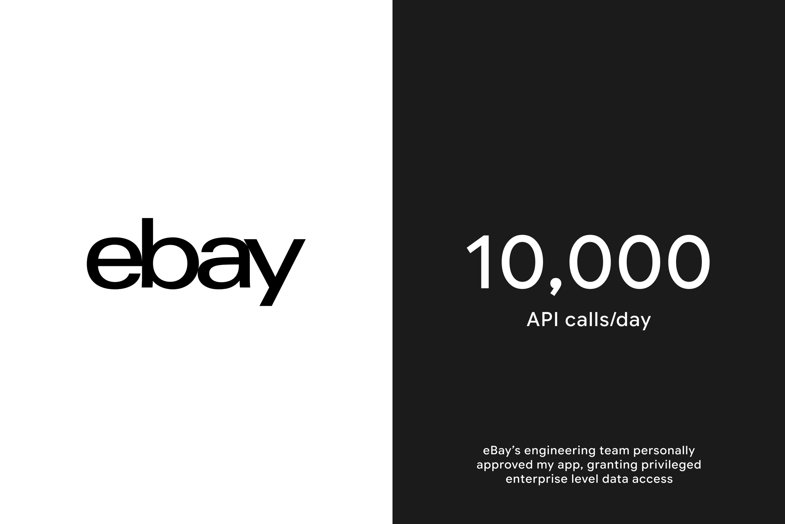
My approach was to flip the model: instead of recruiting sellers first, I bootstrapped supply through eBay's developer API — gaining enterprise-level access (10K API calls/day) to seed Finde with real, structured inventory from existing seller networks. This let me prioritize buyer experience and demand validation before committing to supply side infrastructure.
The strategic bet: prove discovery drives engagement, then use that demand signal to pull sellers in organically.
DESIGN STRATEGY
With supply bootstrapped, the design challenge became making that inventory feel curated and trustworthy (not scraped.) The first decision was where to focus: rather than designing every surface at once, I prioritized the browse and filter experience as the core of the product. If discovery didn't work, nothing else mattered.
KEY USER EXPERIENCE DECISIONS
Familiar UX patterns to reduce learning curve. In a cold-start environment, cognitive load is a conversion killer. I leaned into established marketplace conventions so buyers could navigate confidently from day one.
Discovery first information architecture. Users browse broadly before they filter. The design prioritized emotional discovery. Curated collection toggles like "Linen," "Date Night," and "Designer" act as functional filtering, matching how buying intent actually forms.
Cross-category filtering. A sophisticated tagging system lets buyers combine filters across categories (e.g., blue + jeans + heels), surfacing relevant inventory regardless of how it was originally listed, compensating for the inconsistency inherent in secondhand data.
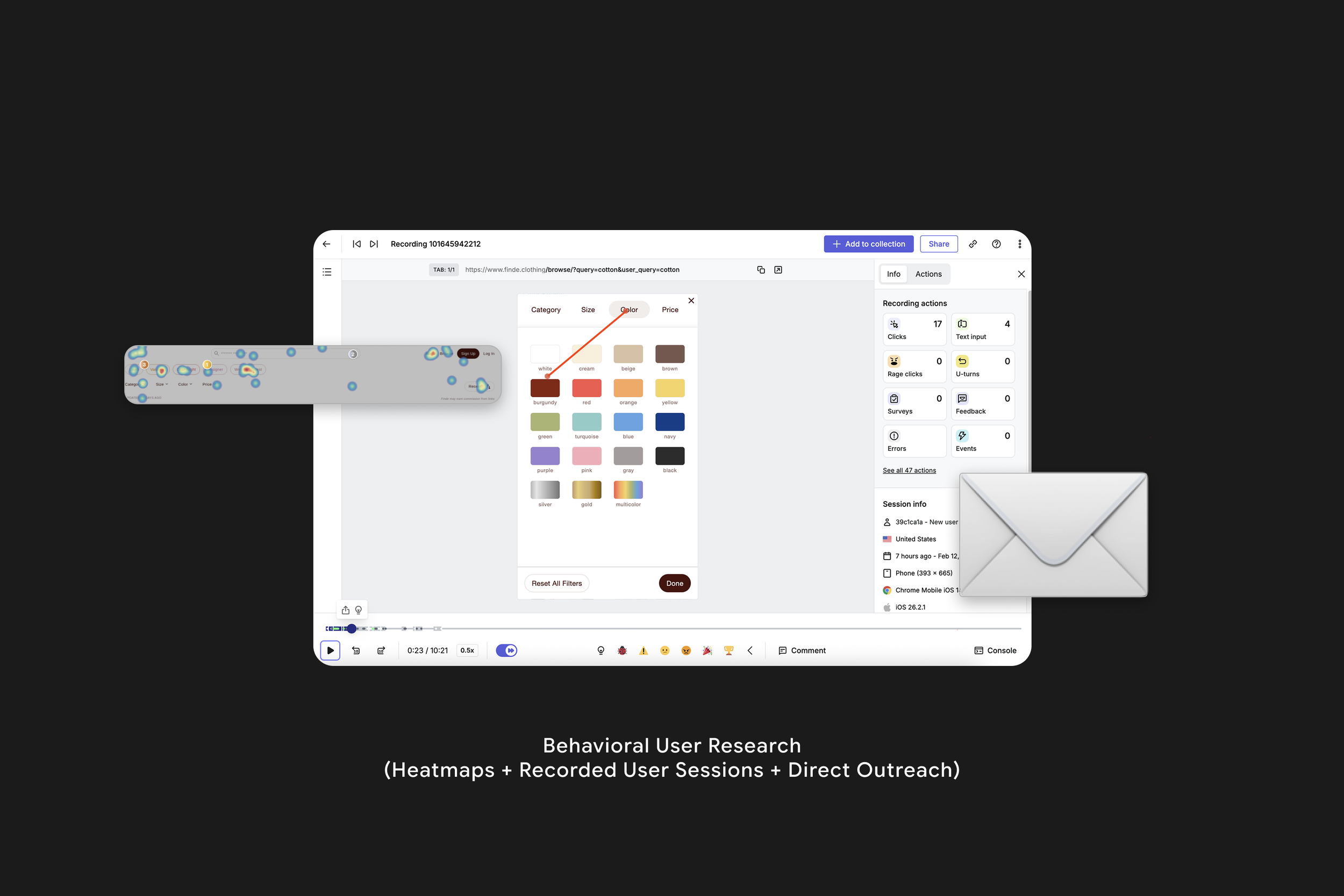
Ship fast, observe, iterate. Rather than extensive pre-launch research, I collapsed the prototype cycle and used post-launch session recordings and heatmaps to observe real behavior, then iterated based on actual usage.
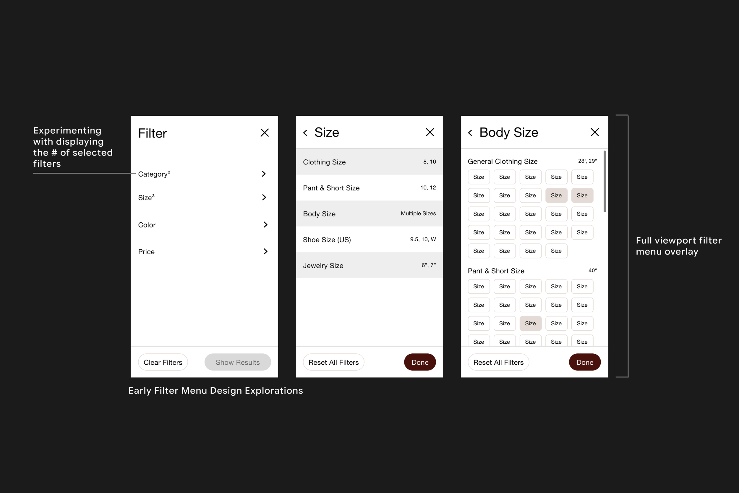
DESIGN PROCESS: FILTER SYSTEM ITERATIONS
The filter system went through three major iterations before landing on the final design. An accordion approach couldn't accommodate category depth. A partial overlay didn't utilize the full viewport. A list based approach buried subcategories. The final design uses horizontal dynamic tabs, allowing fast context-switching between filter types within a full-viewport menu.
Each rejection was documented against specific usability criteria, with competitive references from major e-commerce retailers used to pressure-test decisions.
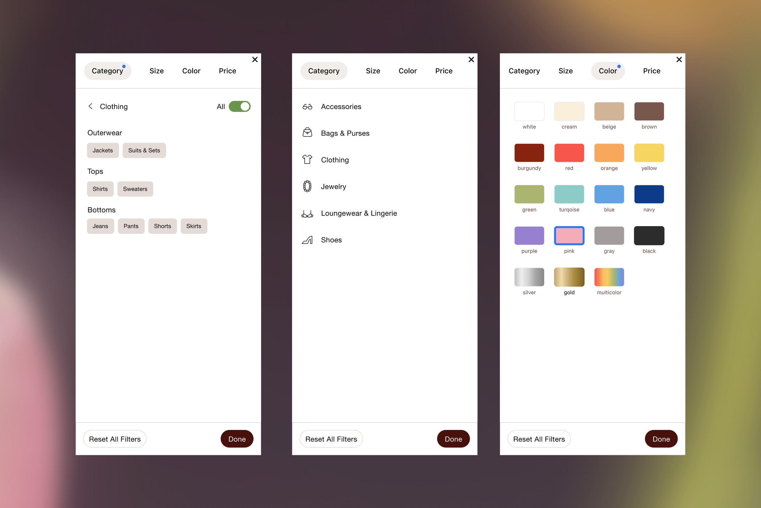
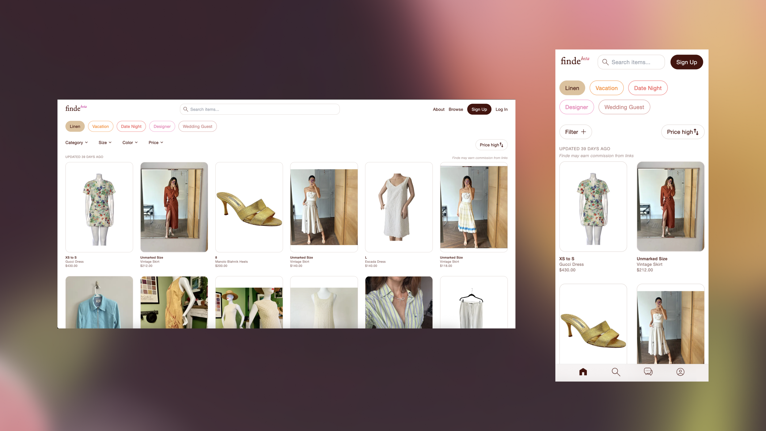
Final Design: Navigation & Filter System, Live Onsite Experience
A clear, intuitive interface that enables fast decision making and a personalized shopping experience through a sophisticated cross category search and tagging system.
Live Onsite Experience, Filter System (www.finde.clothing/browse)
DATA ARCHITECTURE AS A DESIGN CHOICE
Instantaneous filtering was a design requirement from day one, so the backend was architected around the experience before any screens were designed. Results update in real time, without page reloads, because the search logic was built to support it from the start.
Browsing Experience, UI/UX Product Design
A fully responsive design system that preserves functionality and visual clarity across all devices.
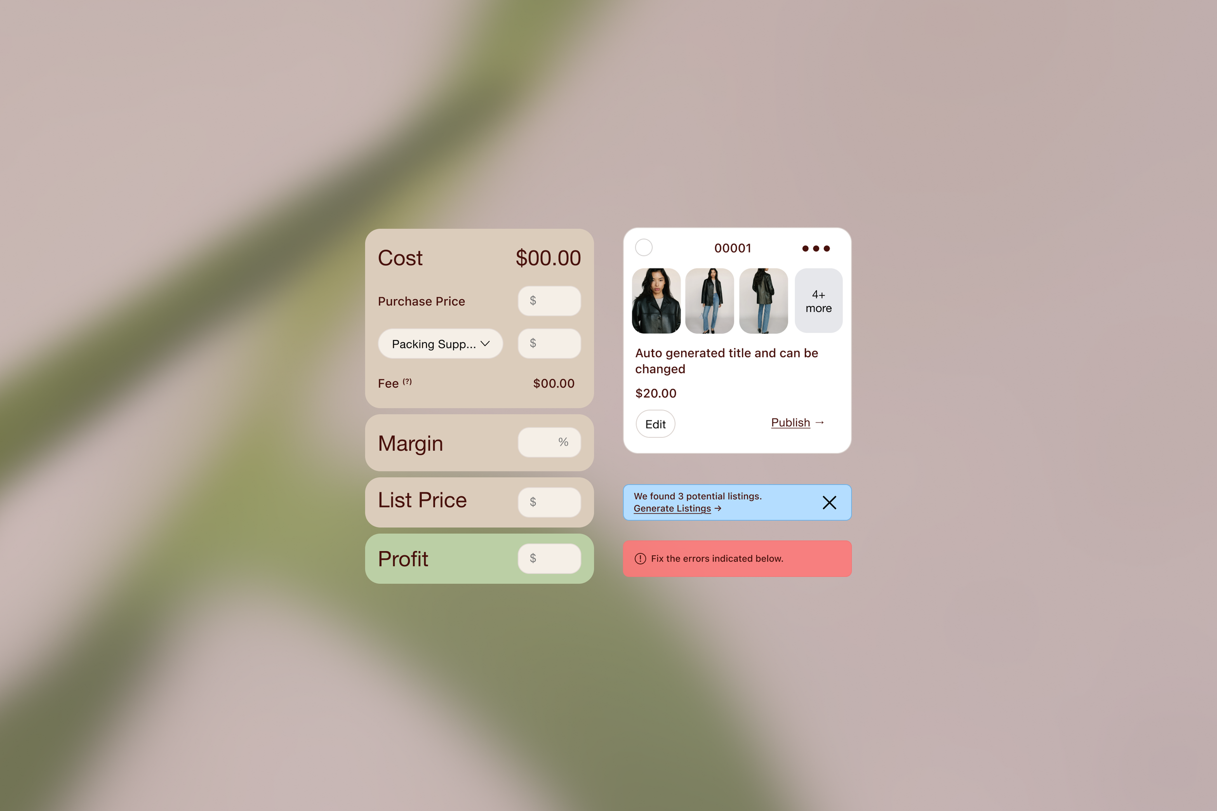
UI/UX Module Design
A cohesive design system where every element brings clarity and consistency across the entire user journey.
A timeless, approachable brand identity anchored by a logo that is clear, legible, and versatile across all visual applications.
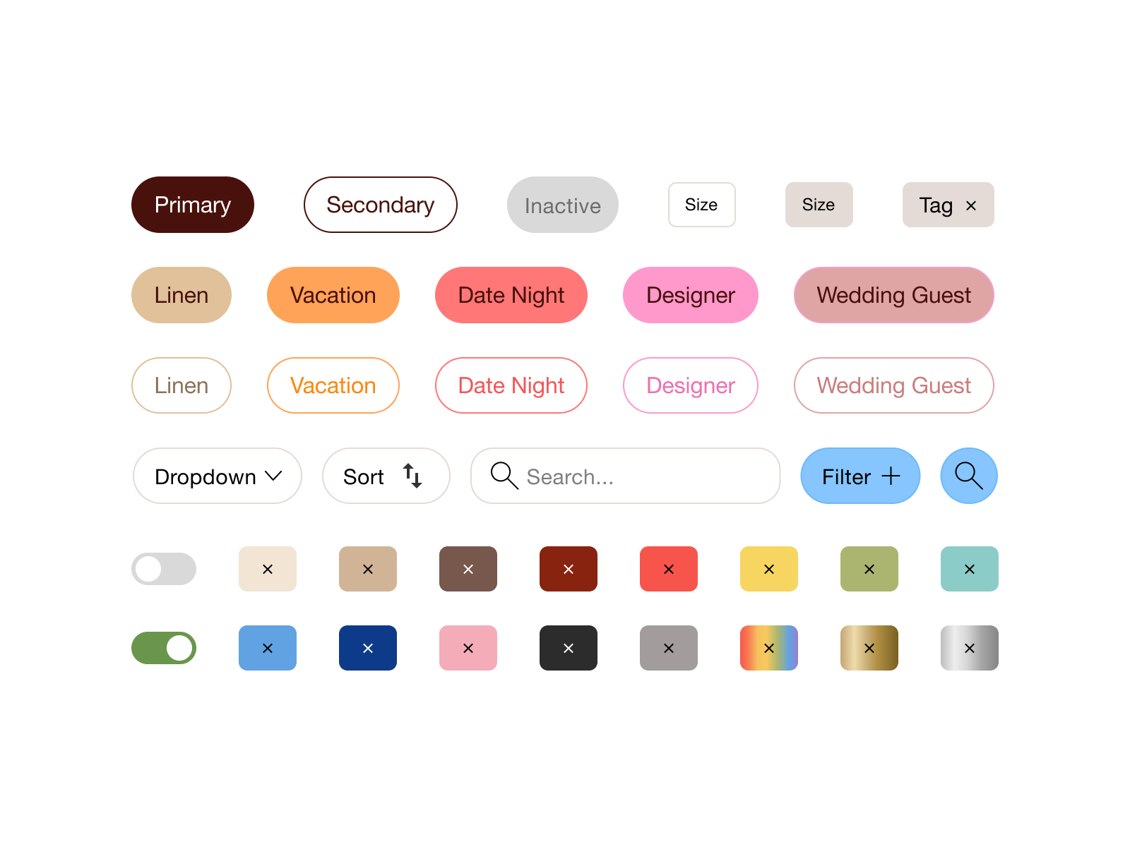
Design System UI Components
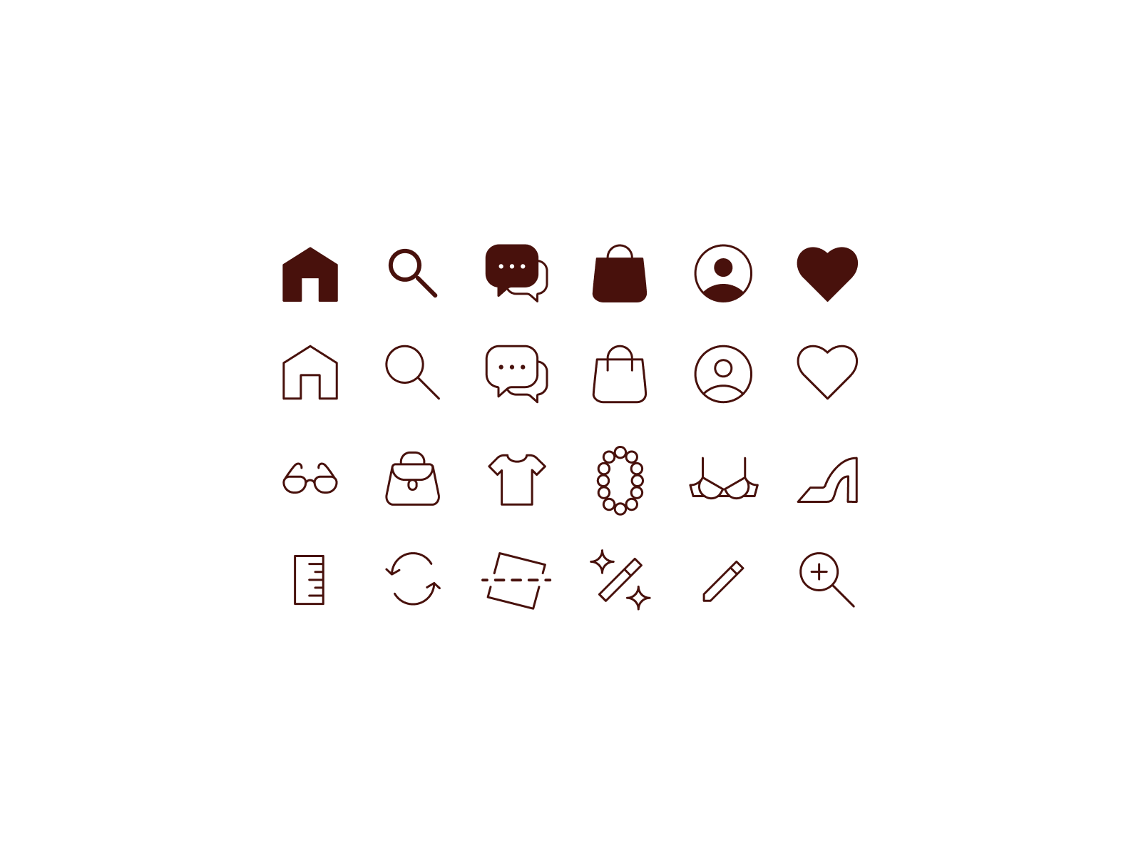
Custom Iconography System
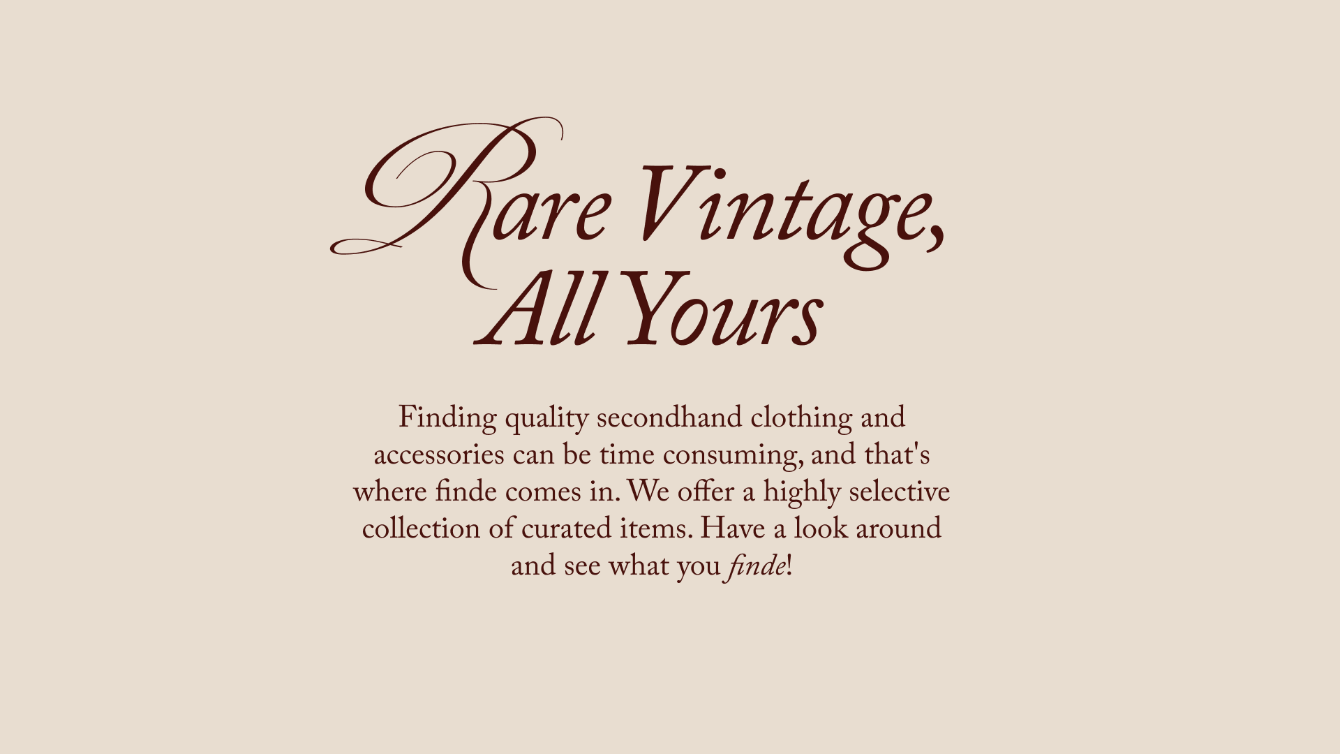
Messaging that clearly communicates customer value and brand differentiation.
OUTCOMES
Finde attracted organic users across 28 countries — including the US, UK, Germany, France, Brazil, China, India, and Australia — with zero paid acquisition. For a bootstrapped, cold-start marketplace, unprompted global reach is a strong early demand signal.
Session data showed high intent discovery behavior: users engaged multiple filter and search interactions per visit, validating the core hypothesis that structured, curated inventory drives active browsing rather than passive scrolling. Browsing patterns also surfaced clear inventory demand signals, identifying which categories and price points attracted the most engagement, directly informing supply decisions.
The takeaway wasn't just that users scrolled. It's that when they arrived, they browsed.
KEY INSIGHT
Discovery is emotional before it's analytical. Buyers don't start with filters; they start with feeling. The design needed to serve both.
WHAT’S NEXT
Editorialized lifestyle content and query ranking to deepen engagement.
Seller onboarding tools informed by direct outreach and pain point research.
Invite-only supply curation to maintain quality as inventory scales.